Mawi Haus
Client: Mawi Haus
Year: 2025
Industry: Property / Hospitality
Deliverables: Brand identity, wayfinding, signage, sub-brand identity (Cup of Mawi)
The Brief
Mawi Haus is a coliving property, built for a home base for people working remotely and living somewhere for weeks or months at a time. The property’s own positioning is direct about this: a place to feel at home, quietly, in Jimbaran (Bali).
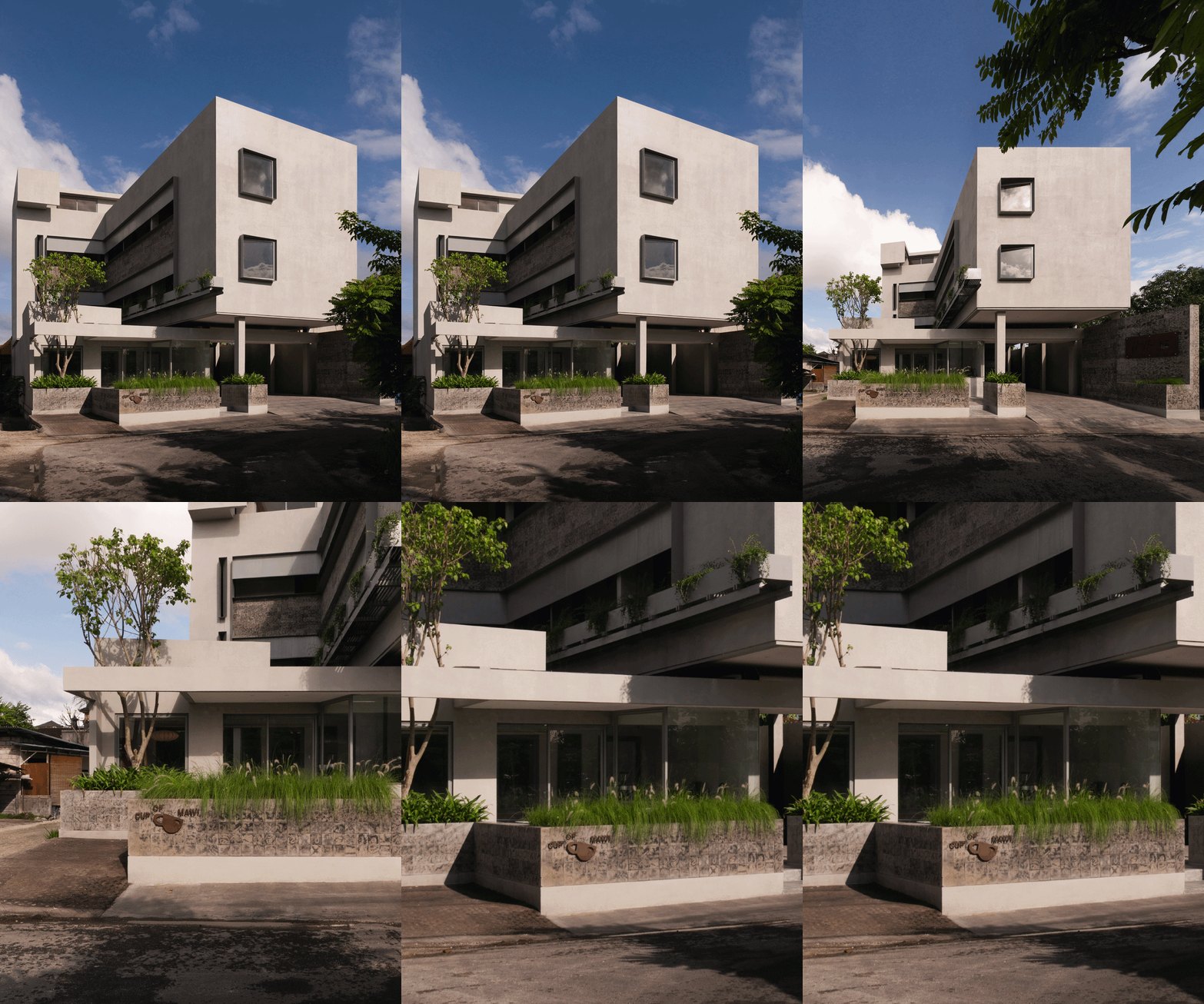
That distinction mattered to the identity from the start. A coliving brand has different obligations than a hotel brand. It needs to feel inhabited. The ground floor houses Cup of Mawi, a coffee shop serving residents and walk-ins alike, which needed its own identity within the Mawi Haus system.
The Work
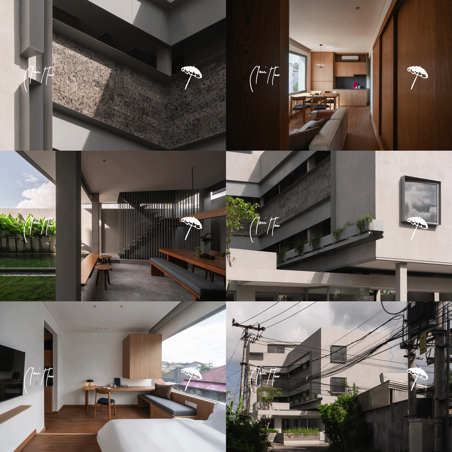
The mark is an umbrella.
Jimbaran Beach is a six-minute drive from the property, and its beachside umbrellas are the area’s most recognizable visual signature. The logo borrows that image directly. But the reasoning runs deeper than visual recall: an umbrella is shelter. It is the single object that represents being looked after in a place that isn’t yours. For a property built on the premise of feeling at home while away from home, an umbrella is the entire emotional proposition of the brand, rendered as a mark.
The wordmark is set in an organic, handwritten style. The brief here was specific: lux but casual. Mawi Haus is a design-forward property, but it isn’t formal, and a rigid, corporate wordmark would have worked against the lived-in warmth the space is built around. The handwriting reads like something a host would write, not a hotel chain.
Typographic Decisions
A logo with personality needs a system around it that won’t compete with it. The supporting typography was built to be timeless and modern: clean enough to stay legible at a glance, restrained enough to let the handwritten mark carry the brand’s warmth on its own. The handwritten mark carries personality. The supporting type carries clarity. Splitting those two jobs between two distinct registers is what keeps the system both inviting and usable.
The System in Use
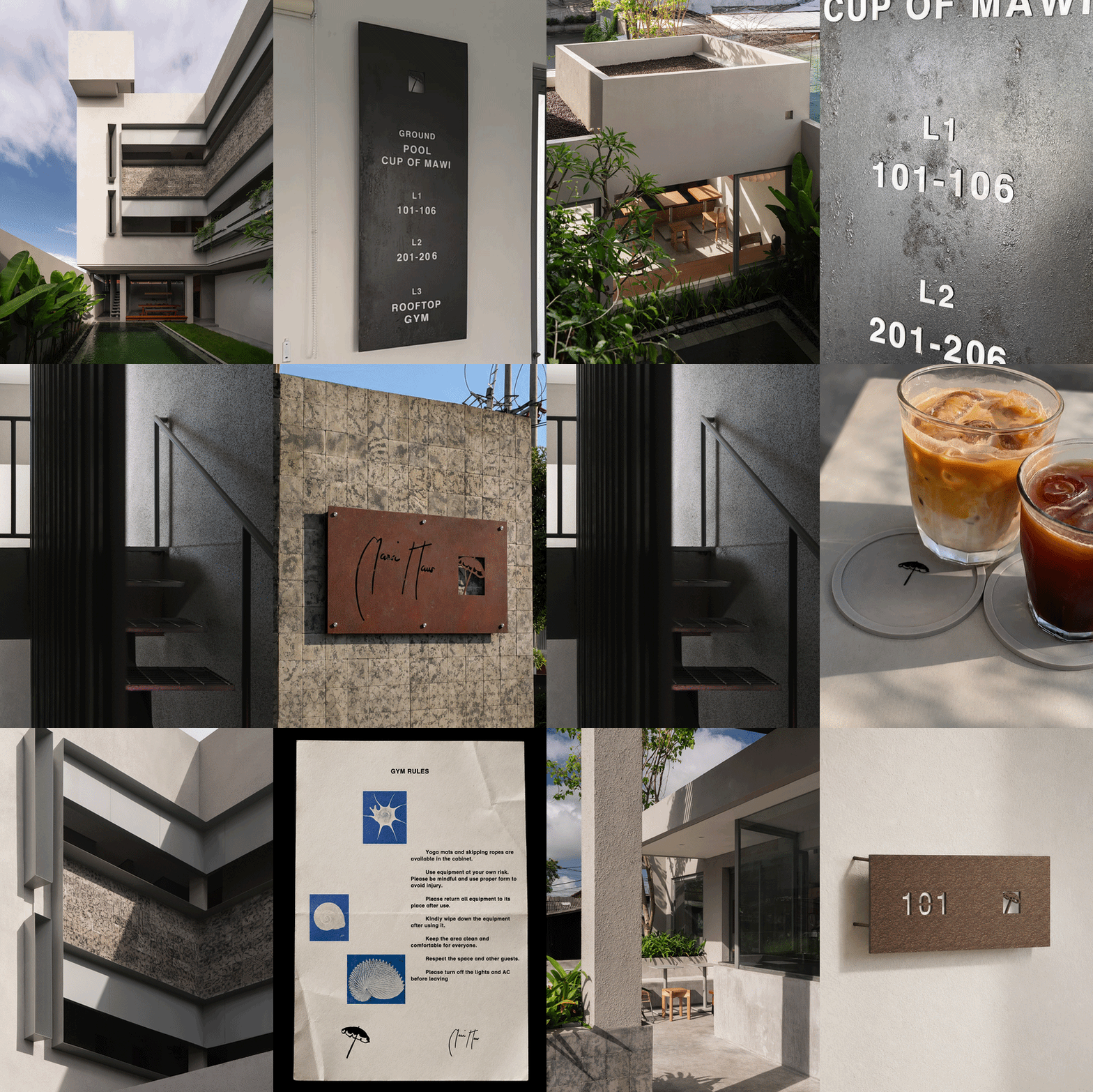
The property spans three floors, and the wayfinding and room numbering system is where that supporting typography earns its keep—the kind of clarity a guest needs after a long flight when they’re just looking for their room.
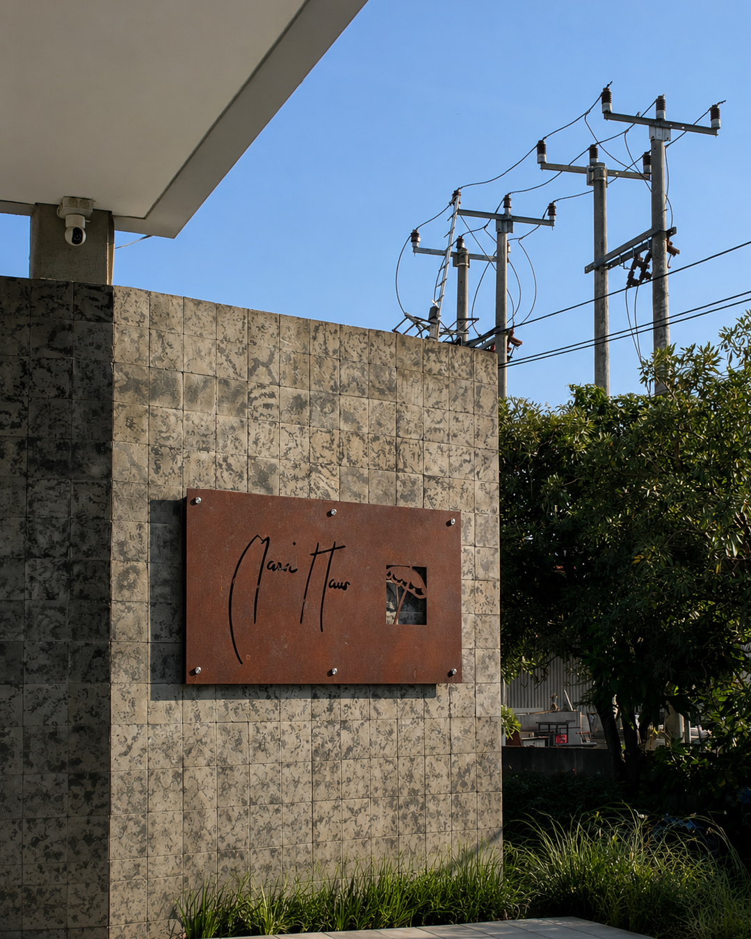
The two entrance signs are where the identity becomes physical and permanent. Both are finished in a bronzing process. Bronze develops a patina over time. It shifts in tone, picks up character, ages visibly rather than staying static. For a property near the coast, that aging process happens naturally and quickly, and the studio leaned into that rather than working against it. A bronze sign that changes with weather and time reads as established, not new—exactly the impression a coliving brand wants when its entire promise is permanence within a temporary stay. A guest arriving on day one and a guest leaving after three months should both feel like the building has been there, settled, the whole time.
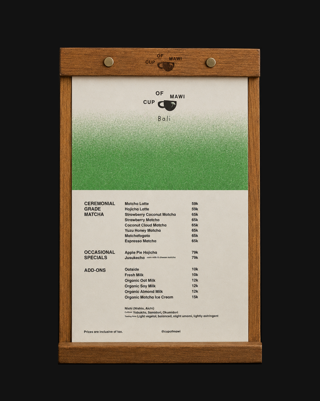
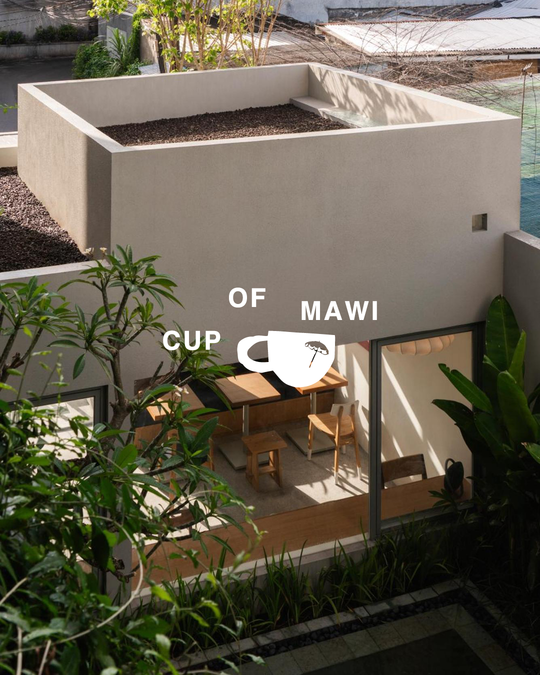
Cup of Mawi extends the system at ground level, built to function as the property’s most public-facing room rather than a separate business operating underneath it.